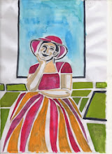
The first project was a natural landscape. I knew from reading the project details that the subject would be the Cedars at Attingham Park in Shropshire. After several trips I had made about 25 sketches including our drawings. I had two false starts, thinking first of a woodcut, then a multi-plate lino cut - neither of which were successful - my technical ability exceeded my ambition - but I had interesting experiments along the way in colour and inking and these will stand me in good stead. I enjoy colour practise with watercolour and pastel so consider this to time usefully spent rather than wasted. However,I settled on a dry point because,quite frankly, I was getting bored of the subject! This is something I need to watch for in future projects. Here is the final print for project 1.

Project 2 called for an urban landscape. Again the choice of subject was not difficult. There is a small lane in Shrewsbury called Grope Lane. I had used the subject previously and not been satisfied with the result so of I went armed again with sketchbook. Several sketches and visits later I came up with a design I was satisfied with. I decided on a collograph using techniques I learnt last year in a workshop organised by my Art Society with the Sidney Nolan Trust. Again an ambitious project due to the angles, lines and complexity and also because I chose to try cutting some very fine lines to add texture and define paving, windows etc. After two coats of shellac in a well ventilated room the plate was as ready as it was going to be.

The third project was a reduction lino cut of an abstraction of an urban scene. I had to start with an A3 line drawing and again I chose Grope Lane as the subject. This time from the other end of the lane. I then had to make four small (5x4 cms) drawings of different parts of the drawing to put together in an abstract design. I refined the design trying to ensure it balanced and then did a black, grey and white painting, again changing lines and tones to try to make the whole design balanced n shape, colour and tone.
With a reduction print, the first choice is what to retain as white(or the colour of the paper) and this is cut out first. Then I made the prints - in this case in grey ink - thinking carefully of the number of the prints I wanted as there is no going back to make more - hence the other term for the technique - suicide print.
 Here is the block after the first cut and before printing in grey . You can see the marks left where I have removed the lino, everything else has been printed in grey but the block also shows the design painted onto the block. What is showing as brown will be cut away after the first printing.
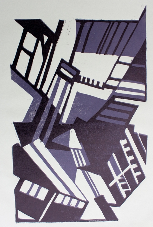


I prefer the orange print but think the design works and it was an interesting project and certainly a method of design I will try again.
Finally on to the assignment. The choice of style abstract or realistic, rural or natural landscape was left to me. I chose a natural realistic landscape in Wales near Beddgelert. The view was out-standing, the light changing every few minutes and clouds racing across the Sky. I made some sketches when we were there ready to start the prints when I got home. This time the assignment called for a set of three prints of at least three colours.
I played around with ideas and came up with some designs which I felt captured the atmosphere of the landscape. The designs I had made were quite small so I tried enlarging one and found that this didn't work so decided to go ahead and print at the same size as the original design. Again I chose dry point and decided to print the different colours on the plate at the same time - a difficult choice since the plates were so small and another steep learning curve. Here are two versions of each design.


I have learnt a great deal during this assignment about design and refining design but also technical aspects of the printing process - the more I learn the more I realise how much there is to learn.