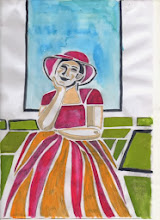
Another interesting piece was by an artist called Christine Bradshaw. The screenprint intrigued me by the way the artist had incorporated text into the design and also the space she had left the viewer's eye to rest in. Her work can be seen at http://www.christine-bradshaw.com/gallery.html. Finally, another piece that held my attention was by Chris Doran. "Run, rabbit,run" is a relief and monoprint. A set of six images mounted together and linked by use of texture, colour and to a degree image. This was an attractive image and an attractive way of presenting the set but let down by a cheap frame. This led to a discussion with my friends about framing - how a good frame enhances but doesn't overpower an image and how a poor frame always detracts.
We then went to BMAG for a private visit to the Print Room, arranged thanks to my friend, Jennifer. This was a real treat. We saw and handled two Picasso lino cuts, some dry points by Whistler and Tissot, an etching by Rembrandt, an etching by Hossler and finally two drawings by Picasso.
"Head of a bearded man" by Picasso is a reduction print. Wonderful expressive marks and a fantastic example of a cubist portrait. The registration is spot on but it is the range, power and use of the marks to describe form and movement that is outstanding. http://www.bmagic.org.uk/objects/1962P39. In contrast the lino cut "Torus Vallauris" shows registration marks and also the marks from cutting in the background of the image but this works for the poster. It is an integal part of the design. My personal preference is to clear the image of cut marks but I can see where they can enhance rather than detract from the image and this is the case with "Torus Valauris". http://www.bmagic.org.uk/objects/1962P43
The other works we saw were equally magical and for over an hour we looked and looked and tried to absorb technique, composition and method. A major lesson learned when looking at Picasso's drawing and Whistler's drypoints is that less is very often more.
A wonderful time enhanced by the knowledge and patience of the curator. I know that in some galleries you can get nose to nose with the image on the wall but being able to look and handle work like this is a fantastic privilege and one that I will not forget for a long time. Has this experience influenced my own work - oh yes - I can't wait to get to grips with a cubist portrait in lino cut - my homage to Picasso.
A wonderful time enhanced by the knowledge and patience of the curator. I know that in some galleries you can get nose to nose with the image on the wall but being able to look and handle work like this is a fantastic privilege and one that I will not forget for a long time. Has this experience influenced my own work - oh yes - I can't wait to get to grips with a cubist portrait in lino cut - my homage to Picasso.

No comments:
Post a Comment