I found the repetitive mark making always meditative and quite soothing. To keep the marks even is very difficult and will take me a great deal of time and practise to master it - if I ever manage to do so but the trial was successful enough to warrant trying it for the larger, final print for the assignment.
Although
I have used the mirror technique of checking for errors in painting and
drawings before I had not noticed the
difference in the "feel" of the reversed image - how changing the
orientation of the flow of an image from right to left can alter ones
perception of it so much. Something else to remember for future projects.

Size was dictated by
the maximum size I can print on my press which is slightly larger than A4. I use a plastic matrix for dry point and
found that the concentration required for the close tonal marks required me to work in stages - I found that if I
pressed on too long, the marks would vary too much. Although I would prefer to
the marks to be as even as those produced by Morandi, I just do not have the
expertise to produce the consistency and found myself instinctively following
the curves of some of the elements. I
was also surprised how hard it
was to reverse the mark making to ensure the flow of the print. It is difficult to tell how the marks will print but from the plate I felt that the necessary tonal contrast had been achieved.

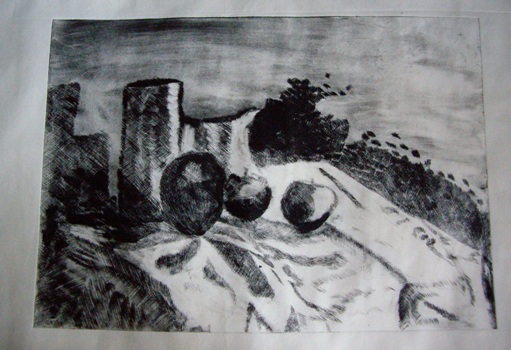
For
the first print on the cream paper, the plate was inked too lightly so the
apples were indistinct and I also felt that the background needed some
texture/tone. I was pleased with the image and felt it was quite successful.
The marks could be a lot more even but this will come with practise.


With the second print, also on the cream paper, I left some tone on the background, behind the pots and above the jug. I also darkened the front pot, and wiped the apple in front of it to emphasise the tone and bring the apple forward.
With
prints 3 and 4 - on white Masa paper-

 I left more tone on the background but it is too
uneven and the tone is too heavy at the top rather than behind the pots. Too much ink has been removed rather than selected to highlight the folds of the cloth The apples are too pale.
I left more tone on the background but it is too
uneven and the tone is too heavy at the top rather than behind the pots. Too much ink has been removed rather than selected to highlight the folds of the cloth The apples are too pale.
Prints 5 and 6 are on the cream Simili paper and I decided to emphasise the tone on the base of the front pot and the apples


The shadow on the right side of print 5 is too faint and the shadow on the right side of print 6 is too dark but I felt that the print was getting stronger in tonal contrastWith prints 7 and 8, I decided to experiment with applying extra ink to certain areas for greater contrast using a cotton wool bud.


This proved to a quite effective way to add back ink to small areas where the wiping had been too rigorous. To an extent it is trail and error as the final effect cannot be evaluated until the plate has been printed but worth the experiment.
The final two prints are the most successful. Both on the white Masa paper and showing the individual items of the still life composition in detail with the tone of the background, shadow and cloth more balanced.

I feel
Print 10 offers the best contrast in terms of tone and I found it the most
interesting and effective. The dark patch of tone behind the highlight on the
jug is interesting. The tone on the cloth is very random and is not as
effective as it could be if I had been ore careful with this part of the image.
Reflections
- There is a limit to the number of prints that can effectively be printed from a plastic matrix and so is not really practical when experimenting with the intention of printing an edition - in future I will use a metal plate - that will give me the opportunity to decide on how I want the image to be without compromising the edition number.
- Since I was aiming for a tonal image, I felt that the pure white Masa paper was more effective than the cream Simili
- The mark making is not even, and this deflects
from the final image. I need more
practise in producing them in a more even manner.
- I enjoyed experimenting with selective wiping and utilise this more in the future