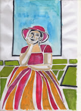
The first two are relatively straightforward - I am working on the design and layout in preparation for the actual prints - one to be of another individual and the others to be self portraits.
In preparation of the woodblock I decided to practise techniques in cutting, colour mixing and printing. I also have ideas for a print based around the stunning colours of the Oilseed Rape Fields at this time of the year. The sharp yellow against the bright spring green is beautiful - cliched perhaps but it has fired my imagination.
I have studied with Sara Lee http://www.saraleeartist.co.uk/ at Rabley Drawing Centre http://www.rableydrawingcentre.com/ a couple of times and decided to revisit the blocks I cut on the first course as a basis for the practise. The design is approximate to what the final print will be and afforded a good basis for developing the marks I wanted in the fields and also to develop the colour mixes I wanted.
Sara taught us using Gouache and I have been interested to read further that this is very popular in Japan now as a medium instead of the original water based inks traditionally used. Like all traditions, new methods and techniques are used applying new materials.
The original print at Rabley was based on tones of blue green and is printed using 5 blocks - one for each "shape" and one for the background paler green that lies beneath all the others. The paper is a yellow Japanese paper and due to the uneven inking of the block shows through the light green background.
 The "cloud like" marks across the top are caused by incomplete clearing and I intended to clear them until AJ - an experienced print maker helping us as a technician on the course pointed out that they added character - so the mistakes were left as learning points and have come in useful in the further development.
 I mixed an acid yellow using lemon yellow with a bit of blue to push it towards the blue spectrum and printed it to underlie the whole block - I cut additional marks in two of the fields and printed with two different shades of green on white Masa paper. I was quite pleased with the colours but wanted a blue Sky and also to try without the cloud effect
http://woodblock.com/encyclopedia/entries/012_03/012_03.html
Then I spotted that I had created green fields with strips of yellow rather than yellow fields with strips of green showing through which can be seen as the oilseed rape blossoms. However I felt that the sense of distance was working well. This print is on cream Simili paper.
I cut the block for the bottom field for print number 3 and left out the top left hand field.
 This is again on white Masa paper and shows the green coming through the ripening yellow. I left some of the wood between the strips wanting to pick up some of the green on top of the yellow to show texture and interest. I do feel that the print needs the top field to balance it though as there is now too much yellow.
For the actual print I would like to
- experiment with the cloud shapes of the original Rabley Fields print rather than a flat sky
- make sure that the fields shapes are balanced so that the yellow isn't so startling although that is the subject of the print, it looks better balanced by the green
- vary the greens so that they recede better
- print on the cream paper - it enhances the colours better than the white
- experiment with the sky - not sure the blue works
- practise the tree,hedgerow line to make it more interesting and more varied
Overall I am pleased with what I have achieved. I have practised the cutting and mixing of gouache and nori to the right consistencies and mixed them fairly evenly on the blocks, dampening the paper worked well,as did the registration process.
I have clearer ideas of what I want in the print of the fields and feel that the practise will stand me in good stead for the portrait I have to do for the course. I intend looking to the Fauvists for inspiration for the semi abstract approach I need. I have painted a portrait using Fauvist colours before but not used them in printmaking so it will be a challenge on all sorts of levels.
 |
| Pastel using Fauvist colours and principles |

No comments:
Post a Comment