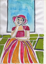
I have a piece of her work and have attended a workshop run by her. Although I have enjoyed the study which included looking at the origins of Japanese and Western woodblock printing and identifying their influences on Jo's work, I realise it would have been a lot easier to have chosen an artist of whom a lot had been written - there would have been more information available and more images. However, the study has given me the opportunity to identify in greater detail what it is I like about her work and that has led me to a greater understanding of what I want to express and how I want my prints to develop.
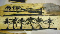
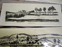 Jo works in woodblock. She trained in Kyoto after training and teaching illustration, design and textiles. She uses traditional methods but with some modern materials such as oil based inks and rollers rather than the traditional water based inks and barens of the traditional Japanese. Her works tend to be low key, almost monotone. She is increasingly experimenting with wood other than the traditional plywood of woodblock printing such as the fence panels shown here, and with her marks that often reference more traditional German Expressionism that Japanese ukiyo-e.
I will use woodblock for this final print because it is a medium I am very interested in and like to explore, and because it is Jo's favoured printing method. I felt that the design for the final piece had to aim to demonstrate the qualities that I like in Jo's work - the quietness, "fleeting moments", nature and have a meditative quality.
 I used mind mapping for the first thoughts for the assignment - bringing together words that were brought to mind when considering Jo's work and the research I had undertaken for the study. I started to look to look at trees, the layers of trees in the landscape, the tops of trees against the skyline or ripples and droplets of water but felt that these images would be copying Jo's work and that I would have difficulty moving away from direct imagery that was more about Jo than about my inspiration from her.
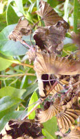
I spent time looking through photographs I had taken. These tend to be visual reminders of images that I felt, at the time, would bear further investigation and I found many of leaves against the sky. I also found many photographs of dead leaves as I like the sculptural shapes they make as they desiccate.
There is a Japanese concept called "wabi sabi" - basically it is an appreciation of the beauty in everyday, often imperfect objects. I feel that this concept sums up Jo's work and that the dead leaves with the memory of summer but with a particular beauty of their own in their form and colour are often overlooked.
"Wabi sabi art challenges us to unlearn our views on beauty and to rediscover the intimate beauty to be found in the smallest details of nature's artistry" from Wabi sabi: the japanese art of impermanence by Andrew Juniper http://www.ribabookshops.com/item/wabi-sabi-the-japanese-art-of-impermanence/75151/
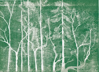 I have a small collection of leaves collected on walks and gathered more to draw and compose. I feel that, in the past, some of my prints have been just studies or vignettes such as this small woodblock that was completed on Jo's course, so wanted the image to be a complete image rather than just a study of dead leaves.
 I have drawn some images but can not resolve, to my satisfaction, the feeling that the resultant image would be a vignette rather than a composed completed image, so have returned to my library of images and sketches for inspiration. Looking at Jo's images again, I feel that they do have a simplicity, an abstraction about them. She has the ability to cut away extraneous detail and allow the view to focus on the form and this does enhance the feeling of a frozen moment in time.
I have decided to sketch and develop more themes to give myself time to decide on the image that I wanted to explore further.


