Sunday 29 December 2013

Assignment 5- imagination

This assignment called for one large collaged mono type on an imaginative theme or a narrative sequence of 3 -5 prints, from own choice print medium.

Inspired by the contextual studies into multi media and narrative prints, I decided that I wanted to produce a narrative sequence. I was considering using a story or nursery rhyme as the starting point when the idea for the print came from a real incident.   A very large spider ran down the bed when I was quietly sitting reading.  This reminded me of the Miss Muffet nursery rhyme and this in turn, of the Nursery Rhyme series of etchings by Paula Rego, which includes a Miss Muffet piece http://collection.britishcouncil.org/collection/artist/5/18742/object/40023/

Using the traditional nursery rhyme as the inspiration, I sketched a figure sitting quietly reading under a tree with the spider hanging high above.  Then a series of thumbnails


 I feel the first and second pieces work as stand alone pieces as well as part of the triptych. However the third piece showing the figure running into the space doesn't work alone.  It  is a boring very plain image without a story.

I then drew a figure on a bed with the spider close to the leg 
but felt the figure jumping off the bed didn't work -and also my drawing wasn't up to portraying the figure well enough and I was unable to transition for a print from 2 into 3 so went back to the idea of a figure sitting under the tree. I tried the "what if...."game to try to resolve the issue of the third piece working as a stand alone.

The alternative storyline involves the figure remaining sitting - in the second print she is reacting to the spider and her hand is raised - to fend off? in alarm? - who knows. In the final print the spider is sitting in her hand on top of the book and she is looking intently at the spider.

The next set of thumbnails considered backgrounds, including trees and hills but I felt the detail on the background diffused the image of the figure and the spider.  I then looked at different positions for the figure - facing left and also facing centre under a much larger tree.

 This minimised the figure making the tree the most important element and this also detracts from the image. I felt the figure facing centre made the image feel to symmetrical and when the figure faces left, it seems to be counter indicative to how we in the west "read" images - the image of the figure facing right and with just the side and branch of the tree showing gives the right emphasis to the figure and the spider and the right balance.

I was still trying to resolve the printing method - my preference would be for an etching as a homage to Paula Rego but I do not have the time for the necessary visits to the Print Centre so was considering collograph/lino cut when I came across the method of silk aquatint in the blog of Sue Brown http://suebrownprintmaker.blogspot.co.uk/2013/12/end-of-term.html  The method gives the deep and varied tones of aquatint but is a collograph method.  I researched the method and realised that prints I had admired and thought of as etchings by Sean Harris http://www.arts-engine.org.uk/index.php?id=44&action=viewOrganisationData&returnID=28&letter=H&OrgID=715001were in fact, silk aquatints.  I therefore resolved to try the method for the assignment. Although this risks prints that are not up to the quality required I feel that it does fulfil the brief to try "experimental and exciting techniques".

I made a trial prints to experiment with the technique. On the plate, I used wood glue to draw the image, but although this is white when wet, it dries clear which caused a problem when inking as I couldn't see the image against the dark acrylic background.  I then made two more plates and drew simple images in white acrylic - building up the thickness in places over a couple of days as the layers dried and also scratching back to create lost details in places. I also amended the original trial plate of the figure with white acrylic to create more tone and texture

After experimenting with the plates, printing them and subsequently building up texture with white acrylic, gloss medium and wood glue - I am still not satisfied with the level and evenness of tone and realise I need more practise with this technique and also some expert advice and am not ready to use the technique for this project.

I re drew the sketch looking at the potential for mark making in lino cut or wood cut.  I was inspired by the lino cuts of Ian Phillips http://www.reliefprint.co.uk/and the wood engravings of Colin See-Paynton http://www.see-paynton.co.uk/index.html and used some off cuts of lino to develop the marks on paper into lino cuts.

I cut the plates utilising some of the mark making from the trial plates. After several proofs I decided to use stencils to reduce the marks from the cleared areas and proceeded to print a small edition of 3 prints of each plate. I decided to use a dark grey ink as I felt black was too harsh and experimented with various combinations, finally deciding on a mix that included a touch of blue.

I started out by hand burnishing on newsprint but reverted to the press for the prints on Fabriano Rospina when I found that I cannot form enough pressure using hand burnishing on the thicker paper

 I am reasonably pleased with the prints. Some marks have come through on the arm and the trousers but I feel these do relieve the large blank space. 

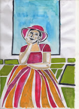
I experimented with hand colouring on one of the proofs.  I prefer the original monochrome images as I do not consider colour ads anything to the image.


Reflections

  • The softer grey of the prints was more effective than the harsh black of the scaled drawing.
  • The stencils to protect the unprinted areas would have been more effective if cut more accurately and from thicker paper
  • With lino cuts I aim to clear all the extraneous marks but looking at the prints, I feel that the marks left he arms and trousers enhance the image.
  • I am pleased with the design but like the effect of the enclosed wood in the experimental print where the tree plate was printed upside down. This provides an opportunity for future development and ties in with my wish for my work to have more layers of interest

  • I don't feel that I fulfilled the brief for explorative or experimental print-making. However, I have tried new methods - silk aquatint and hand colouring - and have explored a wider range of mark making for these lino cuts 
  • I intend to further experiment with silk aquatint and hand colouring
  • I enjoyed the process of developing a suite of prints to tell a story.  From my research into narrative art works I realise that my work is only two dimensional and would benefit from more time spent developing ideas so that the final works are more complex and offer the viewer more interest.

Sunday 1 December 2013

Texture using collograph

The requirement is for a collograph print with the emphasis on texture made from jigsaw blocks.

My first thought was an idea for a print based on a drawing I worked up inspired by a drawing of pears on a plate by Ben Nicolson.  I chose apples as a theme I return to many times when drawing or doodling. However, I felt that it wasn't suitable for a textured collograph as I couldn't "see" the apples with texture.  I then considered a landscape based on the view of rape fields at Rabley Drawing Centre.  I simplified and abstracted the design and felt that it was developing along the right lines.

However, when I came across some ornamental gourds, their textures, shapes and colours seemed very applicable for a textural print. 

I drew several sketches and produced some collages but realised that I needed to look in more detail at the composition - bearing in mind that the final design needed to be suitable for jigsaw plates. I used the Ben Nicolson again as inspiration in the way that his composition used the stalks of the pears to draw the eye around the drawing.  While looking at this stage I also checked the suitability for a jigsaw print by drawing thumbnails and dividing the image into 3 blocks.


 I cut the plates and by referring to the sketches and textures of the actual gourds decided on the following texture:
plate 1 -  masking tape with gaps which are scored with craft knife ,  plate 2 -  ghesso - roughly applied with varied depth and for gourds with bumpy texture - wood glue roughly applied and while wet, textured with medium carbonumdrum and plate 3 - medium texture was created by a mixture of khadi paper, watercolour paper and tissue paper

The project also requires the print to be printed on a variety of textured colours.  So I lightly coated the card left from cutting the jigsaw plates with ghesso which I intend to print with the jigsaw plates. I also had some coloured wrapping paper which are quite light in weight but have been tested for colourfastness so should be alright when dampened for printing the collograph plates.I used a mixture of mono printing, acrylic inks, and chinese ink to colour and texture a mixture of Fabriano Rospina and Somerset velvet printing paper.
The first proof - on cartridge paper - was to see if the texture worked. 
I closely followed the sketch for the plate in terms of colour and tone and was pleased to see the plates and colour were effective. One thing I was not prepared for however was that the plates did not fit each other totally - I assume this is due to the cardboard expanding due to the wet media used for the textures - glue, ghesso etc. This is quite minor but needs to be born in mind for future projects.

The first print was onto deep red hand made texture wrapping paper with a strong leaf design.
The paper was not colour fast but the tone wasn't affected much although the blotting paper was stained.   Again not a successful print because the red of the large gourd is lost against the red of the paper but I do like the red of the paper coming through in places and realise this can be utlised very effectively.  I chose not to wipe excess ink off as much as normally as I was aware that the red of the paper was very strong and was concerned that the print would not be seen which is the case.  The yellow is very thickly inked. It would have been a better print if perhaps it had just been inked in black which would have shown the texture of the gourds and shown up against the red paper.

The second print was onto the paper textured with random acrylic inks.   I think this print is the most effective. The plates were inked more lightly compared with the previously and this means that the texture from the paper comes through the print of the gourds.  This was unintentional but quite effective, but would have been better with more ink.  I have enhanced the colour in places with pastel.

The final print of the session utilised the card that the jigsaw blocks had been cut from.This was very randomly inked using colours left on the inking sheet, and the blocks were not inked from the previous print so is a ghost image. The jigsaw blocks were inserted for the printing which was on a piece of Ho-sho paper.
The print clearly shows how the plates have changed slightly in shape during the making process with white borders around some - however this shows as blind embossing which I find attractive - not appropriate for this image but on the right print could be very effective.

I used other coloured sheets,  one with chinese ink and two monoprints from previous printing sessions. The chinese ink sheet was too dark, but where excess has been blotted away, an interesting texture is left which would be very effective if the gourds had been printed in different colours. Where monoprints were used, I found the colours and patterns coming through too strongly but this could have been better utilised with prior consideration of the colours of inks being used.
Reflections
  • I think the print with the collograph on top of the acrylic ink design most successful - the ink marks make almost an abstract design across, under and through the gourds which add to the texture.
  •  I like the dark red paper as it comes through the collograph design - this can be exploited in various ways in the future.
  • However, I feel the complicated design of the gourds needs to stand alone against a paler background, they are too complex for a textured, highly coloured background.
  • more time spent on considering the background before inking the plates would have led to more successful prints.  I focussed to much on the colours of the gourds rather than the print as a whole.


Print from memory - part 2

The brief was for a mixed media print.  I had decided that I wanted a yellow/red orange background so randomly put coloured acrylic washes on heavyweight cartridge paper. I had two pieces where I had used acrylic transfer - the images chosen quite randomly again - and I also covered these with thin acrylic washes.  I chose acrylic because I planned to use dry-point which requires the paper being dampened and any watercolour washes would be washed out

I chose the print media based on the finalised design. The main figure of the child I wanted to be lino cut and the rest of the figures would be dry-point and I also added the ballet shoes onto the matrix.

The dry point plate was inked in black and proofed on a coloured sheet with the music as chine colle

This showed the dry point as acceptable, the roulette marks in the shoes and in the dresses showed clearly and gave a pleasing variance to the marks. However since the music had not been coloured, it looked odd with the colour behind.  I therefore decided to add the music to the sheets and recolour them before printing.I printed the sheets with the dry point - adding chine colle on some sheets. I found that the very busy and dark sheet that had had acrylic transfer was too busy for the design and was unsuccessful, so need to bear this in mind for future prints.
 
I cut the lino cut from a tracing from the drawing in my sketchbook, using Japanese vinyl which allowed me to cut fine lines.  I also remembered not to cut too deep this time of using and am pleased with the result.  The proof indicated some marks that need to be cleared but they do seem to add a sense of movement so I will keep some on the matrix.

  I then added the lino print, again adding chine colle on some sheets.  I found that, on some sheets, the chine colle did not glue as well as others. I am not sure why this happened as the sheets were coloured with acrylic in the same way and I am confident that the glue was added to the chine colle evenly but they can be glued when the sheets are thoroughly dry if necessary. One one sheet no chine colle was added as I wanted to add the colour with pastel

The final task was to finish off with oil pastel, graphite and conte. The fist piece did not have chine colle over the child's dress so I used pink conte, colouring in the blue bodice and the shoes with red pastel and strengthening some lines with graphite where necessary.  I knocked back the three images at the base of the piece as I do not want them being so prominent.  The next piece was finished with white conte over the middle ground again to make this piece recede and to leave the figure of the child more prominent

Finally with a piece where the child's dress was in chine colle, I used a light ground of white conte over all but the shoes the blue ballet dancer and the child.  These are the most important images and need to be brought forward. 
 
Reflections
  •  The design works and the working out in the sketchbook which led to the final design was worth the effort.
  • the final piece is the best print  in terms of balance of tone and colour
  • I feel that the movement of the original sketch is not fully carried over into the print which is a disappointment, but overall it is successful
  • If repeating the print I would have  a less intense colour in the background so that the most important elements were more prominent and  thus removing the need for the white conte
  • it is the first time I have used a memory as inspiration and Much to my surprise I enjoyed it. I will repeat the process.


Sunday 13 October 2013

A print from memory

When I first considered this project, I came across a reference to the song "Blackbird, bye,bye". I wasn't sure what triggered it but the memory of the song was very strong.  I started to look at pictures of blackbirds and music but quickly realised that the idea had been triggered by looking at artists recently who are using birds as a symbol in their prints and I was trying to replicate them.  So I reconsidered  and the memory I decided to use was one of ballet dancing as a child. I have a clear feeling about the colours, light and feelings associated with the memory and also reading and loving Ballet Shoes by Noel Streatfield as a child. There was also a red ceramic wall ornament  in the bedroom I shared with my sister of ballet shoes and this had to be an element in the development.

After posting the previous assignment which was very rushed at the end due to ill health and prevarication, I had a period of reflection and came to the conclusion that I really had wanted to continue to work on the images - that I hadn't finished the development of the images or worked through all my ideas. I resolved in this new project to work on this aspect - to give myself the time and space to experiment with my ideas to their natural conclusion.

I had first mapped out words, colours, shapes, images  and emotions as suggested. I realised quite early that colour would be an important part of the final print so pulled colours and textures from magazines and collaged them randomly together in my sketchbook
 I was away for a week and worked in my sketchbook, allowing myself to play around with ideas without pressure, using collage, pen, acrylic, acrylic transfer and felt tip and enjoying the process.
I returned feeling these were a good beginning and with plenty of ideas to further develop. When the previous assignment was returned my new tutor said in her feedback " .. you do have a tendency to decide quite early what the final image is going to be and then completely stick with this with small variations of the same". This I feel, is the same as my insight. I give up and make do far too early.
 
The colour palette for the experiments remain the same. Pinks reds and golds featured quite heavily but as I have been developing the idea the colours are becoming more muted and fewer although still either from the yellow or red palette. The key elements from the memory for me where the ballet shoes pottery ornament, the pink tutu that I remember wearing and twirling around and around and these have continued to be important elements

I have experimented with different ideas as they occurred -using both collage and acrylic transfer techniques I have tried a textured background and also drawing the figure on a transparent layer. 
 I also added some words. I thought they would add to the image but they do not belong to my memory of the time so feel out of place.  The transparent layer knocks back the ballet shoes - allowing them to be seen but not be the most prominent part of the design.  I think this adds another dimension to the piece.  My memory also includes the music from the "Sugar Plum Fairy" perhaps every little girl dancers dream song, so I added a few notes of the well known theme.  I realise that I need to avoid these various elements looking just that - disparate elements in space.


 I used the Internet for inspiration of dancers and their movement. I felt originally that these could be a better image for the main figure but seeing them drawn on top of each other I wonder whether they could be used in the background as a repeated motif.  I also felt that the images coming through the paper from the other side was a possibility for experiment. I repeated then over an appropriated image of dancers. Although I feel these images both offer opportunity for development they did not reflect the memory and the story I wanted to convey but certain elements provided useful ideas.
I am sure this is because of the images I have been looking at recently, many of which have repetitive elements as a key part of the design.  I drew a small figure and repeated it on the page and also used the idea of the ballet shoes as a repetitive element but this time in collage.I felt that the gaze of the child was too dominant so tried an image of a child dancer with her back to the viewer - looking into her dream rather than having it behind her and her looking at the viewer. This balances the image better.


The texture of the acrylic transfer gives a worn distance to the background in keeping with a worn memory and I plan to retain this feeling in the final print. However I need to experiment with printing on this type of transfer as I am not sure how an acrylic transfer will stand up to the necessary dampening of the paper for a dry point for instance. I can also achieve the effect I want with either watercolour, acrylic or mono printing.

I had been using a fine line for the drawing, particularly of the figure, giving it a fragile element but after drawing some figures in black and white acrylic marker over a magazine image of dancers, I wondered what the figure would look like sketchily drawn with these markers. It would give more weight perhaps and make the figure a more dominant element.

Deciding to use these markers which make bigger and coarser marks also resulted in feeling that the figure had to larger. I am still working in an A5 sketchbook at this stage so smaller than the final image would be, but of necessity enlarged the figure - realising in doing so that the figure was now definitely the dominant image.  I also abstracted the figure to a degree adding a sense of movement in the skirt which is really important to prevent the viewer feeling that the child is passively watching - she is an eager participant waiting to join in, but feel the ballet shoes are too prominent. 


I reintroduced the idea of music into the image and also the idea of a repetitive element .  The texture behind provides interest.  the figure is not so strong, and the other elements feel as if they have just been placed without real thought to design or meaning.
The figure again feels strong - the yellow textured background helping with here.  I like the figures in the background but want them to be less prominent and perhaps smaller - the ballet shoes, such a key element originally, now looks like an afterthought but the music adds to the image.

I used a print of the music from "The Sugar Plum Fairy in the background - this makes the music a more substantial part of the image than just a string of musical symbols and adding it in the portrait layout works but in the landscape layout it just floats and is not connected.I also went back to adding colour to the image of the figure rather than just a black and white superimposed image. This gives a greater cohesion to the design.
The next images incorporated those elements that I felt were the most important, the music, the shoes, the watching waiting figure, texture and the dancer. The colours, yellow, red and to a lesser degree, blue, were also key. I also moved into a larger A3 format.

 In the final two images, I moved to A3 format and  introduced the idea of a ballet bar. This was the result of looking and analysing the images I had produced so far and finding them wanting. They still had the feel of related elements placed on a page in various ways but without a narrative feel to them. The bar I felt might provide a sense of location but when I placed it between the figure and the rest of the action, I also found that it distanced the  the child from the shoes and the dancer. I  introduced the second image of the child to give a feeling that there was more than one child, to reduce the sense of isolation but then,in the final image, the feeling of movement produced by the three fainter figures coalesces into the child was moving closer to want she wants or aspires to.  Also the child is more substantial still with the movement of the skirt suggesting than she is ready to join in.  This final image feels cohesive and tells the story I wanted to convey.


Sunday 22 September 2013

Assignment 4 - semi abstract self portrait

I looked at various artist as part of the research including Picasso and Matisse. I have always admired the Fauvres for their design and particularly their use of colour and felt that this would be a useful starting point.  I used one of the charcoal drawings for the earlier project as a starting point and drew a stylised head from it.  I made 6 or 7 colour sketches but they didn't inspire me to spend the time that it the project demanded. I will return to this design for further development as I think it holds potential.

 I found a photograph which I liked and decided to use that as a basis. After a charcoal sketch, I stylised and simplified the design and started making several colour sketches.  I tried a different background detail which I later decided to delete and also simplified the image with a thought to technical skills of cutting required.


  I decided on Japanese woodblock as I had already used monoprint, lino cut,  and dry point during this assignment.I upsized the image to fit the blocks and painted a gouche colour image with the final colour decisions to help me with the detail transfer on the plate.


I enjoyed the process of cutting the block although had difficulty with the very small elements of the face and also the thin line in the design. Most of the blocks were cut without a problem, but I did cut the face block twice and also the frame behind the head. The blocks stretched my skills to the limit but I am quite pleased with them.  One of my aims with the woodblock technique is to get more refined lines and I feel that this exercise has moved me on in terms of skills level, although I recognise that I have a long way to go.

This was a long process of cutting 7 blocks, printing profs to ensure that a) the blocks registered with each other and b) then cutting again to try to make the block as clean as possible of unwanted wood for a clean print.   Each block had then to be printed, the print kept damp for the subsequent blocks.

I refined the design with outlines around the green blocks and felt it was an improvement, however on attempting to cut the block for these lines, I found that my technique was not good enough to sustain the degree of accuracy required, so deleted them

The final print - as can be seen - it lacks the vibracy of colour of the gouche painted sketch which is a disappointment. There are also some errors in the registration and also marks carried forward from printing previous plates can be seen


I had experimented with some single colour sketches and decided at the last minute to try a purple and a brown version. Here is the purple version.  As can be seen some of the blocks hadn't been cleaned thoroughly since the previous colour and it spolis the print - however I do think it has potential and will print it again.

 Reflections
  • I had some technical problems which I was unable to resolve around achieving a clean print. 
Although I have attended some workshops in the technique and produced successful work, and have produced successful prints from plates I have prepared and printed at home, I have not before tackled a design with so many colours and printing 10+ prints. The plates became very damp and I think the wood swelled causing that an apparently clean plate to lift and leave faint marks on the print

I am attending a short course on the techniques within the next few weeks so will have the opportunity to concentrate on the technical issues I have encountered.
  • I feel that I was too ambitious with the number of colours, I am not yet competent enough to handle the issues involved in printing from this number of plates
  • I think the design works - it isn't very abstract but I have found that trying to make a design more abstract to suit the brief doesn't work for me as I still find abstract designs difficult to understand
  • I feel the single colour designs are interesting.  The colour has been contaminated by the base colour of the plate - I intend to carry out some experimentation/research to identify how I can remove all trace of a previous colour so that I can change the colour of a print more successfully
  • I was very short of time having already having extended the submission date, so instead of waiting for the prints to dry before applying the next colour, I carried on printing.  I feel that some of the marks on the prints would have been avoided if I had taken more time to print
  • I am disappointed with the prints that I am sending.  They are basically proofs along the road to the final print but I do not want to delay submitting again.. I know that I can achieve a much higher standard than this - however, I intend to carry on experimenting with the plates.
 I intend to:
  •  use some of the prints as a basis for mixed media pieces
  • print it with oil based inks and rollers
  • print the blocks in black and use chine colle for the colour
  • try out some more single colour prints
  • use 2 or 3 of the prints/proofs to cut into strips and weave together as a collage