Sunday 22 September 2013

Assignment 4 - semi abstract self portrait

I looked at various artist as part of the research including Picasso and Matisse. I have always admired the Fauvres for their design and particularly their use of colour and felt that this would be a useful starting point.  I used one of the charcoal drawings for the earlier project as a starting point and drew a stylised head from it.  I made 6 or 7 colour sketches but they didn't inspire me to spend the time that it the project demanded. I will return to this design for further development as I think it holds potential.

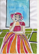
 I found a photograph which I liked and decided to use that as a basis. After a charcoal sketch, I stylised and simplified the design and started making several colour sketches.  I tried a different background detail which I later decided to delete and also simplified the image with a thought to technical skills of cutting required.


  I decided on Japanese woodblock as I had already used monoprint, lino cut,  and dry point during this assignment.I upsized the image to fit the blocks and painted a gouche colour image with the final colour decisions to help me with the detail transfer on the plate.


I enjoyed the process of cutting the block although had difficulty with the very small elements of the face and also the thin line in the design. Most of the blocks were cut without a problem, but I did cut the face block twice and also the frame behind the head. The blocks stretched my skills to the limit but I am quite pleased with them.  One of my aims with the woodblock technique is to get more refined lines and I feel that this exercise has moved me on in terms of skills level, although I recognise that I have a long way to go.

This was a long process of cutting 7 blocks, printing profs to ensure that a) the blocks registered with each other and b) then cutting again to try to make the block as clean as possible of unwanted wood for a clean print.   Each block had then to be printed, the print kept damp for the subsequent blocks.

I refined the design with outlines around the green blocks and felt it was an improvement, however on attempting to cut the block for these lines, I found that my technique was not good enough to sustain the degree of accuracy required, so deleted them

The final print - as can be seen - it lacks the vibracy of colour of the gouche painted sketch which is a disappointment. There are also some errors in the registration and also marks carried forward from printing previous plates can be seen


I had experimented with some single colour sketches and decided at the last minute to try a purple and a brown version. Here is the purple version.  As can be seen some of the blocks hadn't been cleaned thoroughly since the previous colour and it spolis the print - however I do think it has potential and will print it again.

 Reflections
  • I had some technical problems which I was unable to resolve around achieving a clean print. 
Although I have attended some workshops in the technique and produced successful work, and have produced successful prints from plates I have prepared and printed at home, I have not before tackled a design with so many colours and printing 10+ prints. The plates became very damp and I think the wood swelled causing that an apparently clean plate to lift and leave faint marks on the print

I am attending a short course on the techniques within the next few weeks so will have the opportunity to concentrate on the technical issues I have encountered.
  • I feel that I was too ambitious with the number of colours, I am not yet competent enough to handle the issues involved in printing from this number of plates
  • I think the design works - it isn't very abstract but I have found that trying to make a design more abstract to suit the brief doesn't work for me as I still find abstract designs difficult to understand
  • I feel the single colour designs are interesting.  The colour has been contaminated by the base colour of the plate - I intend to carry out some experimentation/research to identify how I can remove all trace of a previous colour so that I can change the colour of a print more successfully
  • I was very short of time having already having extended the submission date, so instead of waiting for the prints to dry before applying the next colour, I carried on printing.  I feel that some of the marks on the prints would have been avoided if I had taken more time to print
  • I am disappointed with the prints that I am sending.  They are basically proofs along the road to the final print but I do not want to delay submitting again.. I know that I can achieve a much higher standard than this - however, I intend to carry on experimenting with the plates.
 I intend to:
  •  use some of the prints as a basis for mixed media pieces
  • print it with oil based inks and rollers
  • print the blocks in black and use chine colle for the colour
  • try out some more single colour prints
  • use 2 or 3 of the prints/proofs to cut into strips and weave together as a collage
     

Assignment 4 - project 2 - self portrait

This called for  a self-portrait,  something I have always been uncomfortable with.  I did some research first looking at paintings, drawings and prints.  My first impression of the self portraits that I found were of very confrontational pieces - this is obvious,  of course, that when one is concentrating on looking in a mirror, ones gaze is likely to be quite intense. Those using photographs can be gentler and more forgiving.

 I started with some drawings looking into a mirror and just as I expected I looked quite fierce, realising that when I concentrate, as several people have commented in the past, I look very bad tempered. But a charcoal drawing was quite effective - I thought originally because of the soft media but perhaps I was starting to relax 


I then tried using a photograph for inspiration. This was a  kinder image because of the faint smile.


When undertaking the research I did come across some self portraits that incorporated images giving an impression of the personality of the artist,so I chose a photograph showing me relaxed and reading - oblivious of the world - a very natural state for me

Recent drawing courses and research into mark making has developed into an interest in a primary working in charcoal - adding and subtracting from my drawings and because this process can be duplicated to a degree, I decided on mono prints for this project.

 I have worked on mono prints quite a bit but haven't tried portraits in this medium so did some experimentation with  paper weights and the effects with hand burnishing and putting the print through the press. I also had to consider the matrix, finding that the plastic matrix I had were either too large or to small for what I wanted to do,  I ended up with using a thin sheet of acetate for the matrix.  This worked fine but had to be attached quite firmly to the workbench while I worked on it. I also completed a couple of mark making exercises  which I found useful as a warm up.   The weather was quite hot during the actual printing process and I found that the ink was much harder to work so also had to experiment with ink consistency.  I found that thinner papers worked much better for hand burnishing and also, to a less extent in the press.

The first prints were based on drawing 3 done from life. The drawing is quite soft, created with charcoal but adding and subtracting as the drawing developed so the monprint  was basically painted using a brush and hand burnished so are quite soft and . I especially like the brush marks in the hair.

I was finding the ink consistency a problem in very warm conditions - difficult to manipulate and becoming tacky very quickly.
The second set of prints is based on a drawing from a photograph.  
Since the drawing was less tonal, I  decided to use back drawing for the print   A slightly better likeness I feel and showing a different aspect of my personality.  I made a deliberate choice to eliminate some details such as around the glasses as I tried to bring some of the experimenting that I have been undertaking in drawings into the prints.  This is something that I have decided that I want to build on in the future.

Finally I chose another photograph as inspiration. This one showed me reading - a lifelong passion.  I decided to use back drawing again for the print but added more tone as a deliberate choice rather than mainly line as in portrait two.


As an exercise in self portraiture I didn't enjoy it, but I did enjoy it as a study exploring mono printing.

None of the prints are successful as likenesses but I think all are effective as prints in different ways and could be worked on in mixed media to develop them. Because of how uncomfortable I feel drawing myself from life, I think the prints from drawings taken from photographs are more successful, I feel they are more relaxed - the tension I felt in drawing the self portrait from life is shown in the print.

Reflections on the project
  • I still don't like self portraits but am a bit more comfortable with them and feel I would benefit both drawing and printing self portraits as part of a series.  
  • I think it would have been useful to have tried a print directly from life
  • I experimented with ink consistency and spent some time exploring this.  The later prints benefit in quality I think due to the thinner more even coverage of the matrix.
  • I decided to revisit this at a later stage when I had finished printing another project and had some ink left.  The weather was cooler and the ink was easier to manipulate .Although one of the prints  is crooked - something I didn't notice until it had been printed - I like the variety of mark making.  The other print was developed using a q-tip and I again find the mark making interesting 


    Developments
I made 17 prints in all over this project and intend working on some of these in pastel/paint or ink - I want to see how far I can push the images.


Assignment 4 - project 1 Portrait of a friend

Assignment 4 is all about portraits. The first project called for a portrait of a friend or relative.  I have drawn and painted Michael a few times, he is happy to sit for me, so didn't anticipate a lot of problems with the sketching preparation.  However, when I finished a couple of sketches I realised that I wasn't happy with them because they didn't represent his character or interests. He also looked quite severe and very serious without his glasses.
I decided to map some ideas in my sketchbook - his hobbies, what he wears etc.  Photography, writing,wine, maps,walking and his hat were all on the list.  I started to look at photos of him as inspiration.  Usually he is behind the camera so the choice was very limited.  I had taken a picture of Michael kneeling to take a photograph. It is a dynamic pose which I think illustrates his energy, he is wearing his hat - even though indoors - to shade the camera and his eyes from the light - anyone who knows Michael will always think of him in his hat, he is taking a photograph - so typical - he is never without one of his four cameras - and his concentration on what he is doing is absolute - again typical. This says everything about Michael - and is very recognisable to anyone who knows him - I have decided to use this as the image to start the project.

The next photo my son took and shows him smiling broadly directly at the camera again wearing the beloved hat - a very obvious choice.  I wanted to include the idea of maps and walking in the design so played around with the photos, pieces of map etc in my sketchbook.  I finally decided on a dry point portrait, a two plate lino cut, chine colle of the map and some bootprints walking over the print. This might not be a conventional portrait but it does show his interests and character.

I found an old OS map that we didn't want anymore and used that as chine colle with the dry -point, the printed the lino cut and finally the bootprints which were cut from individual rubbers and stamped on.  I wanted an uneven effect like a boot print of a muddy boot.

I would have liked to have included a reference to his interest and great knowledge of wines and his work as an author but didn't feel that they could be fitted with the rest of the images I had chosen.

The first proof of the drypoint and map was ok but I was concerned that the map was too large.  I next printed the two-plate lino cut and added the boot prints by cutting two small stamps from rubbers. 

I found that I had to adjust the lino cut and also cleaned more of the plate. I used Japanese vinyl for the matrix. This is a product I haven't used before but which was recommended to me for ease of cutting and the fact that it is economical because both sides can be used. I found it very easy to cut, but, perhaps because I do tend to cut deeply, I found that using both sides was not totally successful as the second plate was mostly cut away and therefore when printing the plate was evenly supported across its whole surface and this impacted both the inking and the printing process which in this case was hand burnished.

Reflections
  • some of the prints where printed on Japanese Simili paper and others on thicker Fabriano Rosbina.  The thinner Simili made better lino cuts but the Fabriano was better for dry point.  I need to experiment with more papers to find the optimum for both techniques for the future.
  • the map paper was too thick for chine colle and was difficult to lay completely flat - it would have been easier and made a better balance on the final print if the map had been smaller.
  • I didn't spend enough time proofing the two plate lino cuts - I had to make further adjustments into the printing which meant that some prints were already spoiled
  • I had taken time to set up an accurate registration system but didn't take enough time making sure the plate was properly placed - hence only one or two properly registered prints.
  • the embossed edge of the dry point and the edge of the map paper interfered with the lino cut - creating white spaces in the print. The print might have been improved in the dry point had been printed after the lino cut.
  • I am disappointed with the simple technical errors I keep making - uneven inking, registration and too little time taken in proofing.  Most of these are caused, I feel, by time restraints.  The prints I make for myself or in workshops show none of these errors, but because of lack of confidence, I delay the actual printmaking for the assignments to the extent that I am always rushed and make silly mistakes.
I realise that I stop working on my prints at too early a stage. I settle on a design and when I am disappointed at the print, I don't review and critical access it and try to identify what I can do to improve it.

In the light of this insight, I decided to review the print even though this would delay submitting the assignment. I do think the print represents Michael - his interests and personality - but decided that the design of the elements could have been improved with a different placing, with a smaller piece of map.  I cut out the elements from a print and rearranged them. I feel this balances better and also, it would mean that the lino cut was printed on flat paper, making the ink lie flatter.  This new design does have plenty of blank paper so there is plenty of space to include representations of Michael's other interests but I don't have the time to explore them with this print.

These prints are more successful
  • the registration is better - I took longer over setting it up
  • the inking is better - although the Fabriano Rospina printed the lino cut much lighter than the Simili - I presume because on the Simili, the ink is sitting on the top of the paper rather than being absorbed
  • I think the final print is better balanced as a design
future development
  • add one of Michael's photographic images from a walk - by gum arabic or emulsion transfer.
  • try different colours for the lino cut - picking out of the colours from the map