Sunday, 5 May 2013

Still Life - preparing the plate and printing the final image

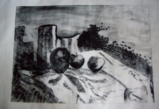
I decided on a trial run so used a small drawing as a guide and produced an A6 plate.  I was relatively pleased with the print although the major error I made of not reversing the image is very much the type of error made by a novice such as myself.


I found the repetitive mark making always meditative and quite soothing.  To keep the marks even is very difficult and will take me a great deal of time and practise to master it - if I ever manage to do so but the trial was successful enough to warrant trying it for the larger, final print for the assignment.

 
For the final image, I did remember to reverse the image and was surprised how different this was.

Although I have used the mirror technique of checking for errors in painting and drawings  before I had not noticed the difference in the "feel" of the reversed image - how changing the orientation of the flow of an image from right to left can alter ones perception of it so much. Something else to remember for future projects.


Size was dictated by the maximum size I can print on my press which is slightly larger than A4.  I use a plastic matrix for dry point and found that the concentration required for the close tonal marks required me to work in stages - I found that if I pressed on too long, the marks would vary too much. Although I would prefer to the marks to be as even as those produced by Morandi, I just do not have the expertise to produce the consistency and found myself instinctively following the curves of some of the elements. I was also surprised how hard it was to reverse the mark making to ensure the flow of the print. It is difficult to tell how the marks will print but from the plate I felt that the necessary tonal contrast had been achieved.
The assignment called for at least 5 prints, which could be the same or all different. I decided to use two different papers for the prints - a warm cream coloured Japanese Simili paper and a pure white Masa paper - this was to see how the image looked on different backgrounds   I have recently seem some etchings by Rembrandt where the same image - of Christ on the cross - was dramatically changed by where Rembrandt had chosen to wipe the ink, thus lightening the image, so I decided to experiment with varying the wiping on the prints to see how the image changed. 

For the first print on the cream paper, the plate was inked too lightly so the apples were indistinct and I also felt that the background needed some texture/tone. I was pleased with the image and felt it was quite successful. The marks could be a lot more even but this will come with practise.


With the second print, also on the cream paper, I left some tone on the background, behind the pots and above the jug. I also darkened the front pot, and wiped the apple in front of it to emphasise the tone and bring the apple forward.

With prints 3 and 4 - on white Masa paper-


I left more tone on the background but it is too uneven and the tone is too heavy at the top rather than behind the pots.  Too much ink has been removed  rather than selected to highlight the folds of the cloth  The apples are too pale.
 Prints 5 and 6 are on the cream Simili paper and I decided to emphasise the tone on the base of the front pot and the apples

 The shadow on the right side of print 5 is too faint and the shadow on the right side of print 6 is too dark but I felt that the print was getting stronger in tonal contrast

With prints 7 and 8, I decided to experiment with applying extra ink to certain areas for greater contrast using a cotton wool bud. 


This proved to a quite effective way to add back ink to small areas where the wiping had been too rigorous.  To an extent it is trail and error as the final effect cannot be evaluated until the plate has been printed but worth the experiment.
 
The final two prints are the most successful. Both on the white Masa paper and showing the individual items of the still life composition in detail with the tone of the background, shadow and cloth more balanced.


I feel Print 10 offers the best contrast in terms of tone and I found it the most interesting and effective. The dark patch of tone behind the highlight on the jug is interesting. The tone on the cloth is very random and is not as effective as it could be if I had been ore careful with this part of the image.

Reflections


  • There is a limit to the number of prints that can effectively be printed from a plastic matrix and so is not really practical when experimenting with the intention of printing an edition - in future I will use a metal plate - that will give me the opportunity to decide on how I want the image to be without compromising the edition number.

  • Since I was aiming for a tonal image, I felt that the pure white Masa paper was more effective than the cream Simili

  • The mark making is not even, and this deflects from the final image.  I need more practise in producing them in a more even manner.

  • I enjoyed experimenting with selective wiping and utilise this more in the future


Friday, 26 April 2013

Still life - a learning curve

The assignment called for setting up a still life, incorporating a fabric drape, with lighting that created sharp shadows - chiaroscuro. The choice of print matrix was left for me to decide.  While I was researching artists and print makers who produce work in this genre, I found myself obsessively drawing little still life's that I found around me. This was helpful because my ideas of what I wanted to incorporate were slowly being defined. These were all pen or pencil drawings because these are the tools that I always have lying around and mostly in my "doodle book" - the sketchbook that I keep by my chair in the living room, but spread out on anywhere and everything - my journal, receipts, magazines - anything.


The first still life I set up was full of complicated drapes and curves.


 I played around with different elements and locations and after some quick sketches I reluctantly had to admit that my skills are not good enough to do the set up justice - either printmaking or drawing. 


So I simplified the image   I found the black and white photographs useful when judging the still life and deciding what type of print matrix to use. 


Some colour sketches followed in oil pastel - here I was trying different  colours and designs, simplifying the shadows, a more abstract approach - with a nod to Ben Nicolson, sharp dark outlines inspired by Samuel Peploe and a straight forward tonal drawing.  I think they all hold potential for further development.

 
Much as I enjoyed working with the colour, I felt that I wasn't sure that I wanted to develop them into prints at this time. I came across Morandi during my research and was able to get to an exhibition of his work
 
I was inspired by his black and white etchings and decided that I wanted to try to produce a dry point using the same marks that can be seen in his prints. I developed large charcoal and pencil drawings large charcoal and pencil drawings in preparation for the plate, at this stage still looking at the design rather than trying to emulate Morandi's mark making


but with some small sketches looking at specific mark making to emulate him.  I want to try to achieve the quiet contemplative mood that his work engenders
I found that my memory of the still life set up was quite strong even after I had dismantled it and that this visual memory allowed me to continue to develop images. Although I had settled on the design and had started working on the plate, I found I was still interested in the set up and continued to develop it for future work.  This is a major step forward for me as, usually, I am quickly bored with an image and once a piece of work has been completed, rarely want to revisit it, but I have a fund of possibilities through this one piece of work that is quite exciting.

For instance, a doodle of apples and pears when listening to a speaker - doodling has always helped me concentrate - led on to a design based on abstract shadow patterns .


and a small sketch with simplified shadows


The next stage is to continue working on the plate and when it is finished print with more experimentation using  inking and wiping to vary the tones


Monday, 8 April 2013

Revisiting a previous project - collograph

Assignment 2 was all about abstract art. This is a subject I have never really been drawn to - liking a few abstract artist such as Rothko, Barbara Hepworth, Kadinsky, Ben Nicolson and Pollack but not really understanding what it was all about and without analysing why I am attracted to some and not others.

Looking at abstract paintings and prints with a more critical eye, I found it easy to identify that colour and texture appealed to me but still found difficulty in understanding what makes a good composition in abstract terms.  I have a little experience of painting abstract art from a short workshop which looked at how emotions and colours and lines are linked in our memories. This however didn’t help with the starting point for the imagery.So, I had no idea how to start this project

I have “Art of Abstract Painting” by Rolina van Vliet on my shelves and for one image she had used an aerial photograph as a starting point . I have often used imagery fleeting seen on the TV, through car windows, in books or captured in photographs as a starting point for a doodle but have never taken the idea further to try to develop it into a piece of work.   This assignment would give the opportunity to explore this to see how far I could push it. I searched through photographic books for images that had some potential. In “The Earth from the Air – 365 new days”  I found an image of the river Lippe in a flood near Olfen, Ruhr region and felt that it had possibilities.

I chose one image to work on in more detail to test whether my ideas would transfer to an abstract image. I worked one of the little thumbnails up to A4 using coloured pencil to play around with colour. I liked the colours of the earth shown in the original photograph and decided to use the same palette of colours in all three images. I then completed a quick watercolour to give the colour in the image more depth, and took the opportunity to make more generous curves than more original drawing. I made adjustments to the image and decided that, for balance the image would require some white – reserving the paper – for more interest. I then tried making the lines more geometric and finalised a design for the print based on blocks of colour, deciding on a multi-plate lino cut.

I had great difficulty with the prints, the plates were not cut well and did not register although I felt the colour was clear and reflected the landscape that the design was based on, the image is not successful as a print or as an abstract. I didn't enjoy the process at all. After a very bad - deserved - critique from my tutor, and a period of despondency, I eventually decided to revisit the image as the failure felt like unfinished business.

I  bought a little book - "starting with Abstract Painting" by Kenneth Jameson - in a second hand bookshop which was very helpful.  The book reminded me of the keys to successful design whether  realistic or abstract: 

colour:tone:texture:line:balance:form:pattern:rhythm:harmony

I used one of the ideas from the book  - cutting a photograph into uneven pieces and using one of the pieces to lead the design. This is a similar process to using a viewfinder and focusing on isolated elements. I decided to use the same source material as in the original print, and to explore some of the ideas using the image as a starting point with the intention of incorporating chine colle and/or monoprint into the final print.

I took an element from the cut photograph and started to experiment with shape and colour - one drawing leading into another drawing.


I also used collage to produce a piece to introduce a textural element. Certain strong shapes emerged in the collage that looked to provide possibilies for the print.

The textures in the collage suggested a collograph as the dense coloured texture element I wanted in the print could be achieved with quite coarse sand. I had the drawings and collage in front of me together with the original inspiration from the photograph, but I wanted the plate to be a further development rather than trying to precisely adhere to a drawn/collaged piece, so used them as inspiration rather than copying them.

The plate as made from mount board with gesso roughly spread on varying thickness on the plate and a palette knife used to create marks inspired by the previous works. Before the gesso dried I scattered rough sand in a focused way, trying to place it in specific places and shapes where I wanted certain elements of the design to be and intentionally varying the lightness and heaviness of the spread in places.

After sealing the plate, I proof inked it using ink left over from a previous print run. This was a darkish green and I used a dobber to apply it to just the raised textured part of the design. I had pre-prepared some paper so that it was damp and ready to use but the first two runs through the press required adjustment of the roller to ensure the right amount of pressure without the danger of the very sharp sand piercing through the layer of tissue and newsprint into the blanket. 

 
She uses quite strong colour which produces some delicate effects on the print which I like so decided to apply primary red and primary yellow to the plate in a considered way first with a dobber and then later with a brush. The results were varied and I realise that I need to really push the ink into the textured service to ensure that the intaglio is inked thoroughly. After inking various plates, I wanted to try the effect of adding chine colle before putting through the press.  I took photocopies of a couple of prints and used oil pastel to imitate the effect of chine colle

I liked this effect so added chine colle - tissue and thin hand made paper stained with acrylic inks in various colours  -to the next few plates, continuing to vary thickness of oil and mixing colour on the plate with the method of "rubs" that Barbara Hartill uses. I also tested out various glues to attach the chine colle - Nori paste, pritt stick and finally liquid PVA applied with a brush. The final results are interesting and provide a good basis for further experimentation.

The textures have potential but I will use carbonundrum rather than sand in the future to achieve a denser more even texture and so that there is less danger of the paper being damaged by the sharpness of the plates.

Some of the marks on the plate are too considered - for instance the radiating lines at the top and bottom are not pleasing.

I think using gesso to produce a lightly texture background emphasised in places with sand has worked and will repeat this next time I experiment

 The addition of chine colle has been effective - giving an almost watercolour effect especially on the lighter prints.

I prefer the prints that are the result of much lighter inking, the dense colour not being as attractive or giving the feel to the image that I wanted.

This set of prints are more successful than the linocuts but I am still uncertain as to whether they work as abstract images.

The assignment has been an uphill struggle from the first mark I made.  However, I have enjoyed this revisiting of the work and have allowed myself to experiment with technique, colour and a new style and will be revisiting it again to see how far I can push the image and where it takes me.

Friday, 5 April 2013

Assignment 3 - Project

The project called for choosing a painting with strong chiaroscuro effects and creating a design to convert into a multi-block lino print. I experienced some false starts in choosing an image I liked, first choosing an image which wasn't thought to offer enough tonal effect and then another image by Caravaggio that on reflection I felt that my technical skill wasn't up to cutting, although I liked my tonal sketch of the piece of image I chose - "Boy bitten by Lizard"

tonal sketch - boy bitten by lizard
Again looking at Caravaggio’s work, I decided to concentrate on the Angel from “Rest on the flight from Egypt” ..http://www.caravaggio-foundation.org/Rest-on-the-Flight-into-Egypt-(Riposto-durante-la-fuga-in-Egitto).html and drew a trial tonal image


I drew this by eye and the proportions are not accurate - meaning that I have lost the lean elegance of the original. The later print would have perhaps benefited if I had traced the image.

I decided that three blocks would be required, the lightest tone being the tone of the paper to cut the key block - block three in the printing sequence - first because I intended to offset this onto the other two blocks to try to ensure more accurate cutting.


key block - block 3 in printing sequence
This worked well until I noticed that the blocks were not perfect rectangles. Something I had assumed. So I  spent time trying to register the blocks one with another and ensuring I had at least one good right angle that I could use as a registration guide when printing. I made a mental note to check that blocks are square before starting the cutting in the future!

Block 1


I found the lino from Hawthorns - slightly more expensive than the lino I had used before - much easier to cut with less resistance with the cutting motion feeling smoother and was therefore able to cut for longer before having to rest my hand. The grey top coating opens up a lighter grey when cut and thus the cut is more obvious than the cheaper lino I had been using - another positive.This was especially important after the first proof of the block when I made some corrections - I could easily see where the new cuts had been made.

   
Block 2
I am pleased with the image - the preparatory drawing sorted out a lot of questions and clarified the design before the block cutting stage and this proof allowed me to make some corrections to the block before printing.
 When I was satisfied with this block -after an issue proof stage and then amendment-  I again inked it with strong black, printed it onto strong cartridge paper and then immediately ran this through the press onto block 2 thus giving a clear reversed image of block one onto block two and when the ink was dry started cutting block two. Oil based inks are a slight advantage in off setting since the ink on the paper stays wet for longer to allow the process of correct registration etc. I would have felt necessary to hurry this process if using water based inks in a warm environment which is my studio. However, my problems with registration later indicated that perhaps I did not spend enough time a this stage.
Printing the first block - I like experimenting with colour and colour mixing so am working with the three primaries , white and black to try to mix the colours I want. Although I realise that it would be easier to use ready made colours and that I will benefit from expanding my range of colours in due course, I feel I am learning a great deal by the trial and error I get with a limited palette. This does mean that I often mix too much ink - which is wasteful - to ensure that I don't run out of the colour for the edition. However I usually have one or two trial prints on the go that I can experiment with and therefore the colour is never wasted. I also find that the oil based inks stay workable for up to two days without having to cover them which is an added advantage.

I wanted an ochre and mixed primary yellow with a small amount of black. This always takes me by surprise because it looks so green on the mixing plate which doesn't happen in other mediums. I used Hawthorns stay open inks - I am still experimenting with these but am finding them transparent, consistent and easy to use. They are also very easy to clear up which is an added advantage.

Transparent ink is recommended for relief printing and I am still experimenting with the quantity. I don't think I used enough at first and the result was not consistent , sticky and took a long while to dry.The colour surprised me by being so clear and transparent but the quality of inking varied too much over the edition. To some extent this was as a result of experimentation due to trying more or less ink on the block and the results varied from a very dense definite green to a light patchy ochre. There is a mottled texture on these prints which appears to be a texture from the block which seems perfectly flat when viewed with the naked eye but which a light rolling of ink emphasises. Since I felt the colour was too dark, I decide just to proof on bread and butter paper and Masa. This I feel is a mistake since both are very white and therefore there is too big a tonal jump. I made a note to compare both Masa and Simili - a warmer toned paper -when I edition again.

Looking at these first prints, I feel the Masa paper prints are better - the colour is more even, this could be because the ink had settled on the block after several prints on the other paper or perhaps the different absorbency of the different paper and they dried much quicker .

Despite feeling that the first colour of the first inking was too dark, I decided to mix enough ink to print all the images to give me more practise with registration. Although the system used by Sara Lee for Japanese Woodblock works very well for hand burnished prints I don't feel it works for me on the press so have a marked outline for both block and paper on the press. I spent quite a lot of time setting it up and feel it works but have noticed in this second printing that the registration from the first printing was not perfect in all the prints. I think this may indicate that I didn't hold the paper flat on the press until the roller had engaged with the print and block or that I was working when too tired and therefore was not as careful as I could have been, but it may come back to the original error in judgement in not checking the lino plates against each other before cutting.

The colour is almost the right tone for the second block, perhaps a bit dark but because the first block colour was too dark, this was a necessity. I am pleased with the contrast between the two colours but there is too big a gradation from the white of the paper.  The inking on the second block is more even. This may be due to the nature of the first block which I doubt as they appear to have come from the same sheet, so it is most likely down to a more precise technique on my part. The image seems to be working well. I can see faults in the cutting of both first and second block but over all I think they are successful.

I mixed the last tone for the first edition -a dark green - made from yellow, transparent ink and slightly more black.  I found that the prints on the bread and butter paper were still a bit sticky whereas the prints on the Masa paper were completely dry. This is due to the absorbency of the paper and I need to take this into consideration in the future. 

Disappointing result - none of the prints are perfectly registered - the paper seemed to be slipping in the press - not sure why, although one print almost acceptable. I have adjusted the roller pressure, have held firmly onto the plate as it going through the press, have varied the ink covering as I felt that I was inking too thickly but still the paper slipped, so feel it might be due to the roller being unbalanced. I think the plate works well with the other two but it is difficult to be sure as the edition printing hasn't worked at all well.

The colours were confirmed to be too dark so the edition would have had to be repeated anyway. The ink stays sticky for a long time on the prints on bread and butter paper and the tissue paper stuck to them. The patterns the ink has left on the tissue paper is very interesting though so I am looking forward to use it in chine colle.

1st edition - final image

I decided to print another edition and have mixed a lighter tone for the first block. I have printed some extra sheets on both bread and butter paper as proofs and some Japanese Simili paper -which is a warmer colour to see if the tones can be better balanced.

Again the print slipped or the registration was not perfect when printed on the press so I tried hand burnishing a print. I was not happy with the result - it has not produced an even covering. This made me realise that I need to practise hand burnishing if I want lino cuts larger than my press will allow, even though previously on the Japanese Woodcuts at the workshops with both Jo McChesney and Sara Lee my hand burnishing techniques led to even and successful results. I therefore returned to printing by press but changed the registration method to a sight method. This produced reasnable results but printing the third plate showed the inconsistencies of plate registration


However, looking at these two images and comparing them with the first, I prefer the colours of the first .


I have learnt: 
  • Since registration issues let down the print, this is a stage I have to work on with more accuracy in the future.
  • The tonal range could be improved and this would highlight the chiaroscuro effect more effectively 
  • Inking needs to be more consistent especially for editioning and a thin coat is needed.
  • lino cut offers more potential to develop more elegant designs then I originally considered and
  • tonal effects can be achieved
  • I can cut fine lines that are sinuous so that I can produce the effects I want through the medium 
  • the design that I have developed works both as a lino print and as a dry point 

Angel - dry point - first proof 
  • and finally, to experiment more with combining images from different print media.

Tuesday, 1 May 2012

Assignment 1 in the post

Well it took nearly 3 months and a lot of blood sweat and tears but the first assignment is in the post - big sign of relief.

The first project was a natural landscape. I knew from reading the project details that the subject would be the Cedars at Attingham Park in Shropshire.  After several trips I had made about 25 sketches including our drawings.  I had two false starts, thinking first of a woodcut, then a multi-plate lino cut - neither of which were successful - my technical ability exceeded my ambition - but I had interesting experiments along the way in colour and inking and these will stand me in good stead.  I enjoy colour practise with watercolour and pastel so consider this to time usefully spent rather than wasted.  However,I settled on a dry point because,quite frankly, I was getting bored of the subject!  This is something I need to watch for in future projects. Here is the final print for project 1.


Project 2 called for an urban landscape. Again the choice of subject was not difficult. There is a small lane in Shrewsbury called Grope Lane. I had used the subject previously and not been satisfied with the result so of I went armed again with sketchbook.  Several sketches and visits later I came up with a design I was satisfied with. I decided on a collograph using techniques I learnt last year in a workshop organised by my Art Society with the Sidney Nolan Trust.  Again an ambitious project due to the angles, lines and complexity and also because I chose to try cutting some very fine lines to add texture and define paving, windows etc.  After two coats of shellac in a well ventilated room the plate was as ready as it was going to be.

The inking wasn't an issue but the cleaning and removing ink before printing took a lot of practise and many prints before I came up with an image half way acceptable.

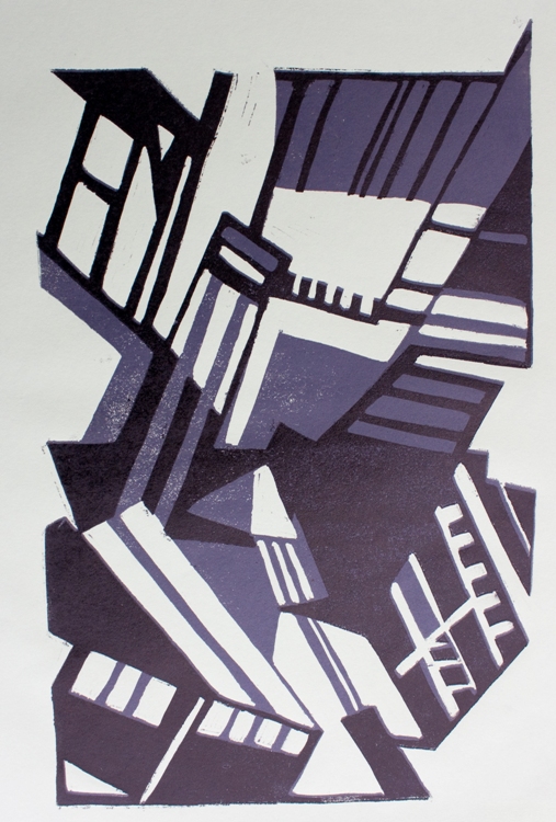
The third project was a reduction lino cut of an abstraction of an urban scene. I had to start with an A3 line drawing and again I chose Grope Lane as the subject.  This time from the other end of the lane. I then had to make four small (5x4 cms) drawings of different parts of the drawing to put together in an abstract design. I refined the design trying to ensure it balanced and then did a black, grey and white painting, again changing lines and tones to try to make the whole design balanced n shape, colour and tone. 

With a reduction print, the first choice is what to retain as white(or the colour of the paper) and this is cut out first. Then I made the prints - in this case in grey ink - thinking carefully of the number of the prints I wanted as there is no going back to make more - hence the other term for the technique - suicide print.

Here is the block after the first cut and before printing in grey .  You can see the marks left where I have removed the lino, everything else has been printed in grey but the block also shows the design painted onto the block. What is showing as brown will be cut away after the first printing.
The next step is to decide what parts of the design I wanted to retain as grey. These areas were then cut away leaving only those areas to be printed in the next colour - black.Since I was printing in black on the prints already printed in grey, registration of the prints was key. I always find this stage difficult and have tried several methods of registration - none being totally successful but again a huge learning curve.  These are the results - are cream, green and orange paper.

I prefer the orange print but think the design works and it was an interesting project and certainly a method of design I will try again.

Finally on to the assignment. The choice of style abstract or realistic, rural or natural landscape was left to me.  I chose a natural realistic landscape in Wales near Beddgelert.  The view was out-standing, the light changing every few minutes and clouds racing across the Sky.  I made some sketches when we were there ready to start the prints when I got home.  This time the assignment called for a set of three prints of at least three colours.   

I played around with ideas and came up with some designs which I felt captured the atmosphere of the landscape. The  designs I had made were quite small so I tried enlarging one and found that this didn't work so decided to go ahead and print at the same size as the original design.  Again I chose dry point and decided to print the different colours on the plate at the same time - a difficult choice since the plates were so small and another steep learning curve. Here are two versions of each design.


I have learnt a great deal during this assignment about design and refining design but also technical aspects of the printing process - the more I learn the more I realise how much there is to learn. 


Monday, 2 April 2012

Visit to Birmingham

I spent a lovely sunny day this week in Birmingham. First we visited the Birmingham and Midland Institute - a wonderful building in itself - to see an exhibition by members of Birmingham Printmakers.  This was a mixed bag but a few items really stood out for technique and image.  The first was a small monoprint by Jenny Escritt.  Just black and white and quite abstract, "Southsea at night 3" was an exercise in restraint but clearly gave the impression of light on water.

Another interesting piece was by an artist called Christine Bradshaw. The screenprint intrigued me by the way the artist had incorporated text into the design and also the space she had left the viewer's eye to rest in. Her work can be seen at http://www.christine-bradshaw.com/gallery.html. Finally, another piece that held my attention was by Chris Doran. "Run, rabbit,run" is a relief and monoprint. A set of six images mounted together and linked by use of texture, colour and to a degree image.  This was an attractive image and an attractive way of presenting the set but let down by a cheap frame.  This led to a discussion with my friends about framing - how a good frame enhances but doesn't overpower an image and how a poor frame always detracts.

We then went to BMAG for a private visit to the Print Room, arranged thanks to my friend, Jennifer. This was a real treat. We saw and handled two Picasso lino cuts, some dry points by Whistler and Tissot, an etching by Rembrandt, an etching by Hossler and finally two drawings by Picasso.

"Head of a bearded man" by Picasso is a reduction print. Wonderful expressive marks and a fantastic example of a cubist portrait.  The registration is spot on but it is the range, power and use of the marks to describe form and movement that is outstanding. http://www.bmagic.org.uk/objects/1962P39.  In contrast the lino cut "Torus Vallauris" shows registration marks and also the marks from cutting in the background of the image but this works for the poster. It is an integal part of the design. My personal preference is to clear the image of cut marks but I can see where they can enhance rather than detract from the image and this is the case with "Torus Valauris".  http://www.bmagic.org.uk/objects/1962P43
 
The other works we saw were equally magical and for over an hour we looked and looked and tried to absorb technique, composition and method.  A major lesson learned when looking at Picasso's drawing and Whistler's drypoints is that less is very often more.  

A wonderful time enhanced by the knowledge and patience of the curator.  I know that in some galleries you can get nose to nose with the image on the wall but being able to look and handle work like this is a fantastic privilege and one that I will not forget for a long time.  Has this experience influenced my own work - oh yes - I can't wait to get to grips with a cubist portrait in lino cut - my homage to Picasso.