Sunday, 22 September 2013

Assignment 4 - project 2 - self portrait

This called for  a self-portrait,  something I have always been uncomfortable with.  I did some research first looking at paintings, drawings and prints.  My first impression of the self portraits that I found were of very confrontational pieces - this is obvious,  of course, that when one is concentrating on looking in a mirror, ones gaze is likely to be quite intense. Those using photographs can be gentler and more forgiving.

 I started with some drawings looking into a mirror and just as I expected I looked quite fierce, realising that when I concentrate, as several people have commented in the past, I look very bad tempered. But a charcoal drawing was quite effective - I thought originally because of the soft media but perhaps I was starting to relax 


I then tried using a photograph for inspiration. This was a  kinder image because of the faint smile.


When undertaking the research I did come across some self portraits that incorporated images giving an impression of the personality of the artist,so I chose a photograph showing me relaxed and reading - oblivious of the world - a very natural state for me

Recent drawing courses and research into mark making has developed into an interest in a primary working in charcoal - adding and subtracting from my drawings and because this process can be duplicated to a degree, I decided on mono prints for this project.

 I have worked on mono prints quite a bit but haven't tried portraits in this medium so did some experimentation with  paper weights and the effects with hand burnishing and putting the print through the press. I also had to consider the matrix, finding that the plastic matrix I had were either too large or to small for what I wanted to do,  I ended up with using a thin sheet of acetate for the matrix.  This worked fine but had to be attached quite firmly to the workbench while I worked on it. I also completed a couple of mark making exercises  which I found useful as a warm up.   The weather was quite hot during the actual printing process and I found that the ink was much harder to work so also had to experiment with ink consistency.  I found that thinner papers worked much better for hand burnishing and also, to a less extent in the press.

The first prints were based on drawing 3 done from life. The drawing is quite soft, created with charcoal but adding and subtracting as the drawing developed so the monprint  was basically painted using a brush and hand burnished so are quite soft and . I especially like the brush marks in the hair.

I was finding the ink consistency a problem in very warm conditions - difficult to manipulate and becoming tacky very quickly.
The second set of prints is based on a drawing from a photograph.  
Since the drawing was less tonal, I  decided to use back drawing for the print   A slightly better likeness I feel and showing a different aspect of my personality.  I made a deliberate choice to eliminate some details such as around the glasses as I tried to bring some of the experimenting that I have been undertaking in drawings into the prints.  This is something that I have decided that I want to build on in the future.

Finally I chose another photograph as inspiration. This one showed me reading - a lifelong passion.  I decided to use back drawing again for the print but added more tone as a deliberate choice rather than mainly line as in portrait two.


As an exercise in self portraiture I didn't enjoy it, but I did enjoy it as a study exploring mono printing.

None of the prints are successful as likenesses but I think all are effective as prints in different ways and could be worked on in mixed media to develop them. Because of how uncomfortable I feel drawing myself from life, I think the prints from drawings taken from photographs are more successful, I feel they are more relaxed - the tension I felt in drawing the self portrait from life is shown in the print.

Reflections on the project
  • I still don't like self portraits but am a bit more comfortable with them and feel I would benefit both drawing and printing self portraits as part of a series.  
  • I think it would have been useful to have tried a print directly from life
  • I experimented with ink consistency and spent some time exploring this.  The later prints benefit in quality I think due to the thinner more even coverage of the matrix.
  • I decided to revisit this at a later stage when I had finished printing another project and had some ink left.  The weather was cooler and the ink was easier to manipulate .Although one of the prints  is crooked - something I didn't notice until it had been printed - I like the variety of mark making.  The other print was developed using a q-tip and I again find the mark making interesting 


    Developments
I made 17 prints in all over this project and intend working on some of these in pastel/paint or ink - I want to see how far I can push the images.


Assignment 4 - project 1 Portrait of a friend

Assignment 4 is all about portraits. The first project called for a portrait of a friend or relative.  I have drawn and painted Michael a few times, he is happy to sit for me, so didn't anticipate a lot of problems with the sketching preparation.  However, when I finished a couple of sketches I realised that I wasn't happy with them because they didn't represent his character or interests. He also looked quite severe and very serious without his glasses.
I decided to map some ideas in my sketchbook - his hobbies, what he wears etc.  Photography, writing,wine, maps,walking and his hat were all on the list.  I started to look at photos of him as inspiration.  Usually he is behind the camera so the choice was very limited.  I had taken a picture of Michael kneeling to take a photograph. It is a dynamic pose which I think illustrates his energy, he is wearing his hat - even though indoors - to shade the camera and his eyes from the light - anyone who knows Michael will always think of him in his hat, he is taking a photograph - so typical - he is never without one of his four cameras - and his concentration on what he is doing is absolute - again typical. This says everything about Michael - and is very recognisable to anyone who knows him - I have decided to use this as the image to start the project.

The next photo my son took and shows him smiling broadly directly at the camera again wearing the beloved hat - a very obvious choice.  I wanted to include the idea of maps and walking in the design so played around with the photos, pieces of map etc in my sketchbook.  I finally decided on a dry point portrait, a two plate lino cut, chine colle of the map and some bootprints walking over the print. This might not be a conventional portrait but it does show his interests and character.

I found an old OS map that we didn't want anymore and used that as chine colle with the dry -point, the printed the lino cut and finally the bootprints which were cut from individual rubbers and stamped on.  I wanted an uneven effect like a boot print of a muddy boot.

I would have liked to have included a reference to his interest and great knowledge of wines and his work as an author but didn't feel that they could be fitted with the rest of the images I had chosen.

The first proof of the drypoint and map was ok but I was concerned that the map was too large.  I next printed the two-plate lino cut and added the boot prints by cutting two small stamps from rubbers. 

I found that I had to adjust the lino cut and also cleaned more of the plate. I used Japanese vinyl for the matrix. This is a product I haven't used before but which was recommended to me for ease of cutting and the fact that it is economical because both sides can be used. I found it very easy to cut, but, perhaps because I do tend to cut deeply, I found that using both sides was not totally successful as the second plate was mostly cut away and therefore when printing the plate was evenly supported across its whole surface and this impacted both the inking and the printing process which in this case was hand burnished.

Reflections
  • some of the prints where printed on Japanese Simili paper and others on thicker Fabriano Rosbina.  The thinner Simili made better lino cuts but the Fabriano was better for dry point.  I need to experiment with more papers to find the optimum for both techniques for the future.
  • the map paper was too thick for chine colle and was difficult to lay completely flat - it would have been easier and made a better balance on the final print if the map had been smaller.
  • I didn't spend enough time proofing the two plate lino cuts - I had to make further adjustments into the printing which meant that some prints were already spoiled
  • I had taken time to set up an accurate registration system but didn't take enough time making sure the plate was properly placed - hence only one or two properly registered prints.
  • the embossed edge of the dry point and the edge of the map paper interfered with the lino cut - creating white spaces in the print. The print might have been improved in the dry point had been printed after the lino cut.
  • I am disappointed with the simple technical errors I keep making - uneven inking, registration and too little time taken in proofing.  Most of these are caused, I feel, by time restraints.  The prints I make for myself or in workshops show none of these errors, but because of lack of confidence, I delay the actual printmaking for the assignments to the extent that I am always rushed and make silly mistakes.
I realise that I stop working on my prints at too early a stage. I settle on a design and when I am disappointed at the print, I don't review and critical access it and try to identify what I can do to improve it.

In the light of this insight, I decided to review the print even though this would delay submitting the assignment. I do think the print represents Michael - his interests and personality - but decided that the design of the elements could have been improved with a different placing, with a smaller piece of map.  I cut out the elements from a print and rearranged them. I feel this balances better and also, it would mean that the lino cut was printed on flat paper, making the ink lie flatter.  This new design does have plenty of blank paper so there is plenty of space to include representations of Michael's other interests but I don't have the time to explore them with this print.

These prints are more successful
  • the registration is better - I took longer over setting it up
  • the inking is better - although the Fabriano Rospina printed the lino cut much lighter than the Simili - I presume because on the Simili, the ink is sitting on the top of the paper rather than being absorbed
  • I think the final print is better balanced as a design
future development
  • add one of Michael's photographic images from a walk - by gum arabic or emulsion transfer.
  • try different colours for the lino cut - picking out of the colours from the map

Tuesday, 30 July 2013

Etching with copper sulphate

I recently attended a two day etching workshop at the Wrexham Regional Print Centre - www.regionalprintcentre.co.uk, tutored by Tracy Hill - www.tracyhill.co.uk.

I have limited experience of acid etching, and was interested in experiencing a less toxic method. The process is the same as the traditional acid method but obviously different chemicals are used.  We used both zinc and aluminium plates as matrices and printed with oil inks onto Hannemuhle and Somerset paper.

Tracey demonstrated every stage which was useful for everyone whatever their previous experience, and she was very relaxed and generous when asked to go over the details again for anyone who needed it.

Firstly the edges of the plates had to be bevelled, to prevent the blankets on the press being damaged but this also means that the final print will be cleaner, and then degreased as grease, including that from fingers, would effect the ground that was to be laid over the plate.

The acrylic ground a mixture of two substances - rather than a traditional wax ground - was then rolled on to the chosen plate. Textures were created by laying various found objects, lace, feathers, net, dried plant material,string, stencils, onto the plate which was put through the press. The plate was then heated on a hot plate to fix the ground and finally placed into the copper sulphate solution.  The solution etches into the areas of metal which have been left exposed by the textures pressed into it. The plate is then cleaned of the remaining ground and detritus from the mordant and printed.  This is my first attempt - two feathers and a piece of unravelling cord on a zinc plate.
Before printing I used a dry point needle to emphasise some of the details of the cord that and also add details of a third feather in the upper left corner to link in with a pale mark that looked like a quill. Ideas for future development includes printing with chine colle to emphasise the feather structures, burnishing the highlights and more dry point work.

I next tried a smaller zinc plate - the same process with the ground but after allowing it to partially dry for a few minutes I added water with a brush. The result is reticulation where the ground - which is water based - partially dissolves with the added water and produces interesting, not entirely predictable results.   Again before printing I added dry point - too faintly as can be seen in the prints but these can be worked on further.

I burnished the un-etched metal of the plate to make the highlights more prominent added a traditional wax hard ground and emphasised some of the dry point marks made earlier and then inked in green as an experiment.  I don't think the colour works and prefer the blue black - the abstract design reminds me of the flint walls of West Dean and in the future I will continue to work on this plate to emphasise this element and perhaps try to replicate the lovely colours one sees in flint particularly when wet.

The next day I worked with aluminium plates.  These are slightly less predictable in the mordant and I decided to try with some semi abstract landscapes. I have had a week drawing mountains recently and these were in the forefront of my mind as inspiration.  The first plate was covered with the ground and then water added for the reticulation.  The abstract shapes reminded me of clouds so the mountain range was added below with a dry point needle and some more water added to provide texture on the land.  The second plate was a thin strip.  I drew onto the ground using a dry point needle for an impression  of landscape and also added a little water reticulation for tone and texture.  On reflection, this was too much for such a small plate - less is more in this instance.  After heating the plates to set the ground, they were put into a saline copper sulphate solution.   The back of the plates had to be covered with plastic tape to prevent the back being attacked by the etch and in that process I must have scratched the larger plate with a small piece of grit. This didn't become apparent until after the print was pulled but as can be seen left quite a prominent series of marks all across the plate.


I inked the plate again trying to remove some ink from the most prominent mark but this seemed to make it more obvious, so decide to add to the scoring with dry point - in an attempt to make a virtue from an error  - and extend some of the marks including the very harsh ones to create a feeling of wind sweeping over the landscape.  This was an improvement and when I inked the landscape in green making it more prominent it made the image more balanced still.  The motto is - make sure the area is perfectly clean before turning the plate over before taping the back!

Finally I decided to try the small landscape with some chine colle - a white tissue with tracings of green ink on it.  The plate is too small for the large piece of tissue so I will print the plate again with smaller additions perhaps in unrealistic colours to emphasise the abstract nature of the marks and to de-emphasise the complicated, detailed landscape I tried to represent.

All in all a very busy two days - lots of experiments and 4 plates that I can continue to work on and develop at home and perhaps take  back to Wrexham for some more etching. I have lots of ideas and intend to play around and see how far I can push them.  


Thursday, 27 June 2013

Exploring drawing with five tutors

This is a West Dean course - www.westdean.org.uk - and entailed 5 days of drawing with different tutors each day.  After the introductory weekend this is the first course in the FDAD that I have just started.

The introduction was by David Stent on Sunday night who gave a short talk on William Coldstream and Ewan Uglow.  Incredible draughtsmen who spent a long time making sure that their measurements and proportions of the individuals they drew were very accurate.  Their drawings and paintings are noticeable not least for the construction lines that remain in the work.  A hard days concentration, drawing, measuring, rejecting and re-drawing followed.  I am still not sure whether the measurements in my final drawing are correct but I do like the fore shorted foot!.  My conclusion here is that I realise I would benefit from spending more time making sure of the proportions in life drawing. Something I was aware of before but had not acted upon.


The next day something totally different. Frances Hatch http://www.franceshatch.co.uk/  aims to incorporate her emotional responses to the landscape, and often that includes her impressions of the noises around her whether they are natural such as birds and winds or mechanical such as a CD playing in the background.  Frances started by playing us some music and asking us to respond in various ways with a variety of implements and media. We were drawing on some discarded brown paper which had been crumbled and then straightened so not precious and everyone seemed prepared and ready to thrown themselves into it.  The resulting pieces covered a huge range from abstract and wild to realistic and restrained.  This set the mood for the day as we progressed through a series of exercises using collage - some from the first pieces which had been reduced to small cuttings, the discarded pieces providing useful collage material.  Frances introduced us to 'Oblique strategies" a set of cards used for making decisions - www.rtqe.net/ObliqueStrategies/.

Frances gave us all a card and asked us to consider how it could help us with the collage that we were working on.  The one given to me seemed to bear no relationship at all but gradually the thought came to me that I hadn't liked one of the marks I had made as a direct response to one of the
instructions Frances had given us.  The comment of the card led me to the thought that the mark was restricting and that I could break it - this I did with collage pieces and think the final piece benefits.

The strategy I found today when I looked was 'Define an area as 'safe' and use it as an anchor' - will have to think how that impacts on my current art project of portraits!

The third day was with Emily Ball. http://emilyball.net/    By this time most of us were flagging with the usual midweek slump of energy. Emily came in with lots of ideas and energy.  We spent some time just making marks with charcoal  - an enjoyable exercise that never fails to surprise and delight. We practised making light and dark and changing the weight of the lines - very basic but something we all need to be reminded of from time to time.  We then held hands with a partner and described the hand of the person just by touch - my drawing looked nothing like a hand unlike some of the otheres but I was surprised how much information for a drawing could be found just by touch alone.

This prepared us for the next exercise - holding a small object hidden from sight and drawing it, using
 the marks we made as a direct response to the touch and feel of the object.  I enjoyed this and I feel it has helped me to become more aware of the range of marks and how the viewer responds to them.  I had already been looking at Van Gogh's mark making in his drawings so was very aware of how boringly nondescript my mark making was.

Emily told us the aim was to "Animate the inanimate"  or to give life to the objects we were drawing by being aware of them three dimensionally and trying to give an awareness to the viewer of that.  I used the same little dried up fish as inspiration for all three drawings - amazing how they differ.

 Another exercise, again in partnership, was a drawing where we took turns to add, remove and replace elements of the drawings - this required us to respond to marks rather than being allowed to be precious about certain marks or passages which we were pleased with but that didn't necessarily balance or add to the rest. As individuals we can be very parochial and wrongly decide to keep something that we have worked hard on but which is spoiling a painting or drawing but when working with another person it is easier to see the whole and, of course, they and you, can take the decision more easily to remove, rearrange that precious part since the emotional tie isn't the same.  An interesting exercise and one I intend to utilise with mono print.
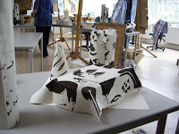
The fourth day was with Carolyn Genders - http://www.carolyngenders.co.uk/   a ceramicist so someone who automatically thinks in the round - a sharp learning curve for me.  The day was a journey from 2 dimensions to 3 back to 2 and then back  to 3 involving paper and finally clay.  Mark making was an important element again but this time noticing how marks made in 2D look when incorporated into three dimensions.  An interesting discussion regarding the difference between shape and form was not fully resolved to my mind but perhaps I need to study more 3D work and undertake a course to fully understand it.  This was only the third time I had worked in clay apart from a very disappointing evening class over thirty years ago and these latest experiences all within the last few weeks, so I was very surprised how much I enjoyed the clay.A future course is planned to help develop an awareness of the 3D which I hope will help with 2D work.

The final day was with Martin Ward http://martinward.net/gallery.htm   This was a short day being the last of the course and stared with a block of wood - we were asked to place it in a position with other elements to give it sculptural significance and drawing it.


After that we arranged for the block to be cut into two to our individual requirements - placed the two elements in a different location and
 again drew them.  Apart from being very tired and having difficulty with angles, proportions and straight lines I enjoyed the exercise.  Not much mark making in my efforts compared to most others in the group, and I was a lot less imaginative in the placement but I felt the mass of the wood was shown. I have shown placement of the blocks as the 3D is more interesting to me than my drawings.

The course developed during the week, each day standing independently but in fact building on the previous days and, I feel, coming in full circle with angles and proportions and measurement.

On reflection, I felt that I learnt something new each day, the main being that when representing something in 2D, it is essential to be aware and try to make the viewer aware of the fact that it is 3D - a variation in mark making, weight of the mark and portraying the mass of the object can help with this as well as accurate observation.

Taking time to look before plunging in with the charcoal, pencil or brush or cutting tool is the most important message I have brought away with me - something that was repeated by each and every tutor.


Sunday, 9 June 2013

Japanese Woodblock

Assignment 4 involves portraits and I have decided to try different methods for the 2 projects and assignment.  One will be a monotype using some charcoal sketches as inspiration, another will most likely by a reduction linocut and the third will be a Japanese woodblock using traditional ukiyo-e techniques http://en.wikipedia.org/wiki/Ukiyo-e .

The first two are relatively straightforward - I am working on the design and layout in preparation for the actual prints - one to be of another individual and the others to be self portraits.

In preparation of the woodblock I decided to practise techniques in cutting, colour mixing and printing.  I also have ideas for a print based around the stunning colours of the Oilseed Rape Fields at this time of the year. The sharp yellow against the bright spring green is beautiful - cliched perhaps but it has fired my imagination.

I have studied with Sara Lee http://www.saraleeartist.co.uk/ at Rabley Drawing Centre http://www.rableydrawingcentre.com/ a couple of times and decided to revisit the blocks I cut on the first course as a basis for the practise.  The design is approximate to what the final print will be and afforded a good basis for developing the marks I wanted in the fields and also to develop the colour mixes I wanted.

Sara taught us using Gouache and I have been interested to read further that this is very popular in Japan now as a medium instead of the original water based inks traditionally used.  Like all traditions, new methods and techniques are used applying new materials.

The original print at Rabley was based on tones of blue green and is printed using 5 blocks - one for each "shape" and one for the background paler green that lies beneath all the others. The paper is a yellow Japanese paper and due to the uneven inking of the block shows through the light green background.
The "cloud like" marks across the top are caused by incomplete clearing and I intended to clear them until AJ - an experienced print maker helping us as a technician on the course pointed out that they added character - so the mistakes were left as learning points and have come in useful in the further development.


I mixed an acid yellow using lemon yellow with a bit of blue to push it towards the blue spectrum and printed it to underlie the whole block - I cut additional marks in two of the fields and printed with two different shades of green on white Masa paper. I was quite pleased with the colours but wanted a blue Sky and also to try without the cloud effect

For this print the first block was blue at the top and yellow for the rest. I attempted a technique called "Bokashi" to blend the blue and yellow on the block before printing - since this is under the hill layer you can't see how successful or unsuccessful this was - it was a good opportunity to practise a difficult technique.

http://woodblock.com/encyclopedia/entries/012_03/012_03.html

 Then I spotted that I had created green fields with strips of yellow rather than yellow fields with strips of green showing through which can be seen as the oilseed rape blossoms. However I felt that the sense of distance was working well. This print is on cream Simili paper.

I cut the block for the bottom field for print number 3 and left out the top left hand field.
This is again on white Masa paper and shows the green coming through the ripening yellow. I left some of the wood between the strips wanting to pick up some of the green on top of the yellow to show texture and interest.  I do feel that the print needs the top field to balance it though as there is now too much yellow.
For the actual print I would like to
  •  experiment with the cloud shapes of the original Rabley Fields print rather than a flat sky
  • make sure that the fields shapes are balanced so that the yellow isn't so startling although that is the subject of the print, it looks better balanced by the green
  • vary the greens so that they recede better
  • print on the cream paper - it enhances the colours better than the white
  • experiment with the sky - not sure the blue works 
  •  practise the tree,hedgerow line to make it more interesting and more varied
Overall I am pleased with what I have achieved. I have practised the cutting and mixing of gouache and nori to the right consistencies and mixed them fairly evenly on the blocks, dampening the paper worked well,as did the registration process. 
 
I have clearer ideas of what I want in the print of the fields and feel that the practise will stand me in good stead for the portrait I have to do for the course. I intend looking to the Fauvists for inspiration for the semi abstract approach I need. I have painted a portrait using Fauvist colours before but not used them in printmaking so it will be a challenge on all sorts of levels.

Pastel using Fauvist colours and principles


Sunday, 5 May 2013

Still Life - preparing the plate and printing the final image

I decided on a trial run so used a small drawing as a guide and produced an A6 plate.  I was relatively pleased with the print although the major error I made of not reversing the image is very much the type of error made by a novice such as myself.


I found the repetitive mark making always meditative and quite soothing.  To keep the marks even is very difficult and will take me a great deal of time and practise to master it - if I ever manage to do so but the trial was successful enough to warrant trying it for the larger, final print for the assignment.

 
For the final image, I did remember to reverse the image and was surprised how different this was.

Although I have used the mirror technique of checking for errors in painting and drawings  before I had not noticed the difference in the "feel" of the reversed image - how changing the orientation of the flow of an image from right to left can alter ones perception of it so much. Something else to remember for future projects.


Size was dictated by the maximum size I can print on my press which is slightly larger than A4.  I use a plastic matrix for dry point and found that the concentration required for the close tonal marks required me to work in stages - I found that if I pressed on too long, the marks would vary too much. Although I would prefer to the marks to be as even as those produced by Morandi, I just do not have the expertise to produce the consistency and found myself instinctively following the curves of some of the elements. I was also surprised how hard it was to reverse the mark making to ensure the flow of the print. It is difficult to tell how the marks will print but from the plate I felt that the necessary tonal contrast had been achieved.
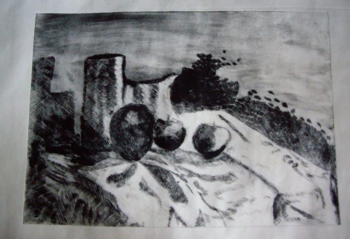
The assignment called for at least 5 prints, which could be the same or all different. I decided to use two different papers for the prints - a warm cream coloured Japanese Simili paper and a pure white Masa paper - this was to see how the image looked on different backgrounds   I have recently seem some etchings by Rembrandt where the same image - of Christ on the cross - was dramatically changed by where Rembrandt had chosen to wipe the ink, thus lightening the image, so I decided to experiment with varying the wiping on the prints to see how the image changed. 

For the first print on the cream paper, the plate was inked too lightly so the apples were indistinct and I also felt that the background needed some texture/tone. I was pleased with the image and felt it was quite successful. The marks could be a lot more even but this will come with practise.


With the second print, also on the cream paper, I left some tone on the background, behind the pots and above the jug. I also darkened the front pot, and wiped the apple in front of it to emphasise the tone and bring the apple forward.

With prints 3 and 4 - on white Masa paper-


I left more tone on the background but it is too uneven and the tone is too heavy at the top rather than behind the pots.  Too much ink has been removed  rather than selected to highlight the folds of the cloth  The apples are too pale.
 Prints 5 and 6 are on the cream Simili paper and I decided to emphasise the tone on the base of the front pot and the apples

 The shadow on the right side of print 5 is too faint and the shadow on the right side of print 6 is too dark but I felt that the print was getting stronger in tonal contrast

With prints 7 and 8, I decided to experiment with applying extra ink to certain areas for greater contrast using a cotton wool bud. 


This proved to a quite effective way to add back ink to small areas where the wiping had been too rigorous.  To an extent it is trail and error as the final effect cannot be evaluated until the plate has been printed but worth the experiment.
 
The final two prints are the most successful. Both on the white Masa paper and showing the individual items of the still life composition in detail with the tone of the background, shadow and cloth more balanced.


I feel Print 10 offers the best contrast in terms of tone and I found it the most interesting and effective. The dark patch of tone behind the highlight on the jug is interesting. The tone on the cloth is very random and is not as effective as it could be if I had been ore careful with this part of the image.

Reflections


  • There is a limit to the number of prints that can effectively be printed from a plastic matrix and so is not really practical when experimenting with the intention of printing an edition - in future I will use a metal plate - that will give me the opportunity to decide on how I want the image to be without compromising the edition number.

  • Since I was aiming for a tonal image, I felt that the pure white Masa paper was more effective than the cream Simili

  • The mark making is not even, and this deflects from the final image.  I need more practise in producing them in a more even manner.

  • I enjoyed experimenting with selective wiping and utilise this more in the future


Friday, 26 April 2013

Still life - a learning curve

The assignment called for setting up a still life, incorporating a fabric drape, with lighting that created sharp shadows - chiaroscuro. The choice of print matrix was left for me to decide.  While I was researching artists and print makers who produce work in this genre, I found myself obsessively drawing little still life's that I found around me. This was helpful because my ideas of what I wanted to incorporate were slowly being defined. These were all pen or pencil drawings because these are the tools that I always have lying around and mostly in my "doodle book" - the sketchbook that I keep by my chair in the living room, but spread out on anywhere and everything - my journal, receipts, magazines - anything.


The first still life I set up was full of complicated drapes and curves.


 I played around with different elements and locations and after some quick sketches I reluctantly had to admit that my skills are not good enough to do the set up justice - either printmaking or drawing. 


So I simplified the image   I found the black and white photographs useful when judging the still life and deciding what type of print matrix to use. 


Some colour sketches followed in oil pastel - here I was trying different  colours and designs, simplifying the shadows, a more abstract approach - with a nod to Ben Nicolson, sharp dark outlines inspired by Samuel Peploe and a straight forward tonal drawing.  I think they all hold potential for further development.

 
Much as I enjoyed working with the colour, I felt that I wasn't sure that I wanted to develop them into prints at this time. I came across Morandi during my research and was able to get to an exhibition of his work
 
I was inspired by his black and white etchings and decided that I wanted to try to produce a dry point using the same marks that can be seen in his prints. I developed large charcoal and pencil drawings large charcoal and pencil drawings in preparation for the plate, at this stage still looking at the design rather than trying to emulate Morandi's mark making


but with some small sketches looking at specific mark making to emulate him.  I want to try to achieve the quiet contemplative mood that his work engenders
I found that my memory of the still life set up was quite strong even after I had dismantled it and that this visual memory allowed me to continue to develop images. Although I had settled on the design and had started working on the plate, I found I was still interested in the set up and continued to develop it for future work.  This is a major step forward for me as, usually, I am quickly bored with an image and once a piece of work has been completed, rarely want to revisit it, but I have a fund of possibilities through this one piece of work that is quite exciting.

For instance, a doodle of apples and pears when listening to a speaker - doodling has always helped me concentrate - led on to a design based on abstract shadow patterns .


and a small sketch with simplified shadows


The next stage is to continue working on the plate and when it is finished print with more experimentation using  inking and wiping to vary the tones